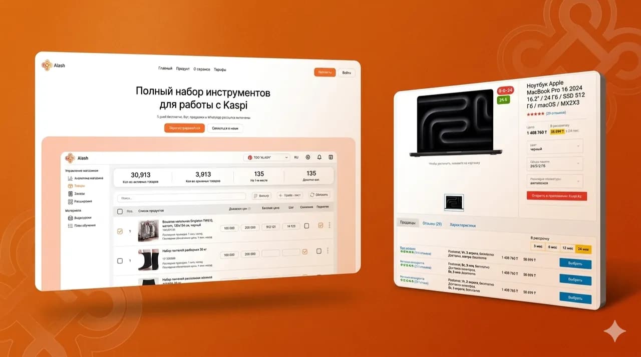
Look at your analytics: for most companies, 70–80% of visitors come from a phone. Yet the website was most likely designed on a large monitor — the designer delivered a desktop layout, and the mobile version was «squeezed in somehow». Technically it opens. But it's uncomfortable to use, so people leave without sending a request.
Below we break down the typical mobile mistakes: the first screen, the menu, forms, buttons, speed, popups and content. At the end you'll find a mini-checklist to test your site from your own phone in half an hour, and guidance on when small fixes are not enough and an adaptive redesign is needed.
Why the mobile version is not a «shrunken desktop»
Responsive layout is often understood literally: «everything is the same, just stacked in one column». The site opens on a phone, nothing falls apart — so the mobile version exists. Formally, yes. In practice — no.
On a phone, the context is different. A small screen, a finger instead of a cursor, mobile data instead of office Wi-Fi, and a minute of attention while the person rides a bus or waits for coffee. A site built «from the desktop» ignores this context.
How the mobile scenario differs from the desktop one
- The screen is several times smaller — it fits one meaningful block, not the whole page
- Instead of a precise cursor there is a finger, and mouse hover simply doesn't exist
- Sessions are shorter: people browse on the go, between tasks, constantly distracted
- The connection is unstable — a page that «flies» in the office loads painfully on 4G in transit
- Typing on an on-screen keyboard is hard, so every form field is expensive
- Leaving is easier: competitors sit in the same search results, two taps away
Each of these differences alone seems minor. Together they mean a mobile page must be shorter, simpler and faster than the desktop one — not the same page, only narrower.
How the design mistake shows up in metrics
You don't need an audit to suspect the problem. Comparing segments in your own analytics is enough.
- Mobile conversion to requests is two to three times lower than desktop with the same traffic
- A high bounce rate specifically from mobile advertising
- People open the form but don't submit it
- Time on page from phones is noticeably shorter, scroll depth — one screen
At Qazaqsoft, our UX audits almost always start with comparing the mobile and desktop funnels. The gap between them usually speaks for itself: the traffic is the same, the requests are not.
What designing «from mobile» means
The mobile-first approach is not a buzzword but a working order. The phone screen is designed first: what the person sees first, where they tap, how they send a request. The desktop is built on top of that later.
It's a question of content priorities, not just layout. When space is scarce, you have to honestly decide what matters: the request button or a banner about «15 years on the market». On a large monitor this decision can be postponed. On a phone it can't.
The first screen on a phone: what must fit
The first screen is what is visible before scrolling. On a phone it's a very small area, further eaten up by the site header, the browser bar and the cookies banner.
A person spends a few seconds on the first screen. If in that time they haven't understood where they landed and what to do here, they won't dig deeper — they'll go back to search.
Four things that must fit into the first screen
- What you offer — a headline that gets to the point, without «innovative solutions for your business»
- For whom and where — city, niche, segment, so the person recognizes themselves
- The target action — a visible button for a request, a quote or a booking
- A quick contact channel — a phone number or messenger for those who dislike forms
If all four don't fit, sacrifice anything except the headline and the button. These two elements are the first screen.
What most often wastes the space
In most projects we review, the first screen is occupied not by answers but by decoration.
- A huge logo and a bloated header with duplicate links
- A slider with abstract banners no one watches to the end
- A welcome text along the lines of «Welcome to our website»
- A full-screen stock photo under which the headline is unreadable
- A cookies or promo banner covering a third of the screen
Every such element pushes the point and the button down, out of sight. Some visitors simply never reach them.
A quick first-screen check
Open the site on your own phone in incognito mode and count five seconds. Don't scroll.
Answer three questions: is it clear what's being offered; is it clear it's for you; can you see what to tap to leave a request. If at least one answer is «no» — the first screen doesn't work.
Forms: length, keyboards, phone masks
The request form is where mobile conversion is lost the most. The person has already decided, opened the form — and left on the third field. Every extra field costs noticeably more on a phone than on desktop: typing on an on-screen keyboard is slow and awkward.
How many fields to keep
For a first request, a name and a phone number are enough. The manager will clarify everything else in a conversation — and will do it better than a form.
- Remove email if no one actually writes to it
- Move the address, the budget and project details to the stage after first contact
- Keep the comment field, but make it optional
- If there are more than four fields, split the form into short steps with progress
In our projects, a short two-field form consistently brings more submissions than a detailed questionnaire. Details are better clarified by voice, not by fields.
The right keyboard for every field
When a person taps the phone field, a numeric keyboard must open. In the email field — a keyboard with the @ symbol. If a regular layout opens instead, the person has to switch it manually — and some abandon the form right there.
- The phone field must have the tel type so the numeric keyboard opens
- The email field — the email type with auto-capitalization of the first letter disabled
- Autofill must work: the phone and name are inserted from the device memory with one tap
- The focused field must not be covered by the keyboard — the page has to scroll itself
These are settings that take a developer minutes. But in forms built «from the desktop» they get forgotten all the time.
Phone mask: a help or a hindrance
A good mask inserts +7 by itself, formats the number while typing and forgives extra characters. A bad one blocks pasting a number from the clipboard, complains about correct input and wipes what's already typed.
- The mask must accept a number pasted from the clipboard in any format
- Better to pre-fill the country code than force people to type it
- Show the error after a submit attempt, not in red while typing
- The error text must say what to fix, not just «invalid format»
And always test the form from a real phone after every site update. A broken mask is one of the most common reasons why «the requests suddenly disappeared».
Ask a question or leave a request
We'll run a UX audit of your mobile version: walk the customer path from the ad to the submitted form, and check the first screen, the menu, forms, buttons and speed on real devices. You'll get a prioritized fix list — from quick wins to adaptive redesign tasks, with the expected impact of each.
By submitting the form, you agree to the processing of personal data.
Loading speed and heavy images
On a phone the site is most often opened from an ad or social media — on mobile data, in motion, with an unstable signal. Every extra second of loading means visitors who didn't wait and closed the tab before the first screen even appeared.
What makes it especially painful is that these visitors are already paid for: the ad click was charged, but the person never saw the page.
What usually slows the mobile version down
- Photos uploaded at full size straight from a camera or a stock site
- A video background on the first screen that loads before the text
- Dozens of third-party scripts: chats, pixels, map widgets, call tracking
- Fonts in five weights of which only two are actually used
- Sliders and animations dragging their libraries onto every page
In our experience the main culprit is almost always the same — images. A single uncompressed photo can weigh more than all the rest of the page's code.
What to do about it
- Compress images and serve them in modern formats like webp
- Lazy-load images below the first screen — as the user scrolls
- Load the map and videos on click, not together with the page
- Review third-party scripts every six months and switch off the dead ones
- For the first screen — no carousels or video backgrounds, just text and one light image
Pages often get several times faster with no redesign at all — just by putting the images and scripts in order. These are the cheapest conversion points you can get.
How to measure speed without a specialist
Open the free PageSpeed Insights service and check your site in the mobile tab. Look not at the final score but at the time until the main content appears — that's what the visitor actually feels.
And make the test more honest: turn off Wi-Fi and open the site on your phone over mobile data somewhere outside the office. These are the conditions in which most of your customers see you.
Content: tables, long texts, readability
Website texts are usually written and approved in documents on a wide screen. There a six-line paragraph looks fine. On a phone it turns into a wall of text a screen and a half tall — and gets scrolled past without reading.
Tables and price lists
A wide table is the classic victim of mobile adaptation. It either runs off the screen edge or gets squeezed into unreadable cells of two stacked words.
- Turn table rows into cards: name, price, timeline — one under another
- Keep two or three key columns on the phone and move the rest into expandable details
- If horizontal scrolling is unavoidable, show a clear hint that the table scrolls
- On mobile, a price list works better as a «service — price» list than as a grid
Long texts
- Paragraphs of two to four lines on a phone screen, no more
- A subheading every two or three paragraphs so the text can be scanned
- Format enumerations as lists, not as comma-separated strings
- The main takeaway at the start of the block, details below for those who need them
A person on a phone doesn't read — they scan: their eyes catch on subheadings, lists and numbers. Text without anchor points is just gray noise to them.
Readability
- A font size that lets the text be read without pinch-zooming
- Contrast: light gray text on white looks nice in a mockup and is unreadable in the sun
- Line spacing with air — dense text on a small screen is tiring
- The important things — prices, terms, phone numbers — must not be set in the smallest type
The test is simple: hand the phone to a forty-five-year-old and ask them to find the price of a service. Wherever they squint and zoom — that's where the fixes are.
How to check the mobile version yourself: a mini-checklist
You don't need a contractor for the initial diagnosis. You need your phone, mobile data and half an hour. One condition matters: walk the path as a customer, not as the owner who knows where everything is.
A ten-step checklist
- Open the site on your phone over mobile data in incognito mode, without Wi-Fi
- Time how many seconds it takes for a readable first screen to appear
- Without scrolling, answer within five seconds: what's offered, for whom, where to tap
- Open the menu and find a specific service and its price — count the taps
- Submit a real request through the form and check which keyboard opens in each field
- Try pasting a phone number from the clipboard into the masked field
- Tap the phone number on the site — a call should start, not text get selected
- Walk through the page with the thumb of one hand and note every miss
- Record every popup: when it appeared and whether it closed easily
- Walk the full path from an ad to a request — from the exact ad you pay for
What to write down
Record every place where you stumbled, hesitated or missed. Don't judge «pretty — not pretty», only «convenient — inconvenient».
The resulting list is a ready-made fix backlog. Sort it into «fixable in a day», «needs a designer» and «needs re-architecting» — and you'll close half the items this very week.
When you need an outside view
Self-checking has a ceiling: the owner knows the site by heart and physically can't see it through a newcomer's eyes. Habit forgives the site what scares the customer away.
At Qazaqsoft, the first thing we do in UX audits is walk the mobile path from the ad to the submitted request — most of the critical findings hide exactly there, not on the desktop everyone is used to showing in presentations.
When an adaptive redesign is needed
Not every problem in this article is cured by a redesign. Most are point fixes that can be made without rebuilding the site. But there are situations where patching is pointless.
When point fixes are enough
- Forms: trim the fields, fix the mask, set up the keyboards
- Speed: compress the images, defer maps and videos, switch off extra scripts
- Popups: reconfigure the display scenarios and the close crosses
- Buttons: enlarge the tap targets, add a sticky panel with the action
- Texts: split the paragraphs, add subheadings, rebuild tables into cards
These jobs are measured in days, not months, and almost always pay off quickly: the traffic is already there, you just need to stop losing it.
When point fixes won't save you
- The design was drawn for desktop only, and the mobile version is an automatic squeeze with no design work
- The layout is old and fragile: every fix breaks something elsewhere
- The page structure doesn't match the mobile scenario — the point and the action are always «somewhere below»
- The site is built on a website builder and you've hit its mobile limitations
- Mobile conversion is several times lower than desktop even though point fixes were already made
If you recognized your site in two or three items, further patches are an expensive way of postponing the decision. Every month of delay is paid for with the ad budget pouring into a mobile version that doesn't work.
How to approach a redesign without losing what works
- Start with an audit and analytics: which pages and scenarios bring requests now — these must not be broken
- Design the mobile layouts first, with the desktop derived from them
- Migrate the site in stages, starting with the pages your ads point to
- Measure mobile conversion before and after — otherwise you'll never know whether the redesign worked
An adaptive redesign is not «repainting the site». It's rebuilding the scenario for a finger, a small screen and a minute of attention. That's how the mobile traffic you already pay for turns into requests.